If you have not yet shared your prezi with me, do it!
The Prezi presentation one of the last grades of this semester. If you do not share the presentation, you will score a "1" on each learning target (see rubric from Friday's class.)
At the top of the prezi editing page there is a "share" button.
Also, on the Prezi viewing page, there is a spot to share underneath the presentation.
Make sure to share with samot46@gmail.com.
Monday, January 19, 2015
Monday, December 15, 2014
How to write analysis captions.
Presenting the data may be the most important part of an experiment. In science, the analysis of the data will present the results of your experiment to your audience. To maintain scientific rigor, it is important to be transparent and reveal everything - the "good" and the "bad"!
Calculations and Summarizing Data
You will need to perform calculations on your raw data in order to get the results and to generate a conclusion. A spreadsheet program is a good way to perform such calculations, and then later the spreadsheet can be used to display the results. Be sure to label the rows and columns--and don't forget to include the units of measurement (grams, centimeters, liters, etc.)
You should have performed multiple trials of your experiment. Think about the best way to summarize your data. Do you want to calculate the average for each group of trials? Should you summarize the results using percentages? Where does an error analysis come in? Is it better to display your data as individual data points or use averages?
Do any calculations that are necessary for you to analyze and understand the data from your experiment.
- Use calculations from known formulas that describe the relationships you are testing. (Rate = change in magnitude / change in time.) Or use averaging!
- Pay careful attention to your units.
Graphs
Graphs can be used to present your results in different ways. (The science PBAT requires tables, charts and graphs!) What kind of graph is best for your data?
- Bar graphs are used when comparing groups, variables or sets of trials.
- Line graphs are best at showing trends of something over time, or over distances.
- Scatterplot graphs are useful when trying to see if a pattern or relationship exists between the data sets.
And lastly, for any type of graph:
- Generally, you should place your independent variable on the x-axis of your graph and the dependent variable on the y-axis.
- Be sure to label the axes of your graph— don't forget to include the units of measurement (grams, centimeters, liters, etc.).
- If you have more than one set of data, show each series in a different color or symbol and include a legend with clear labels.
Results
To write the analysis (Results) section of your paper;
1. Think about what tables you want in your paper.
2. Enter all your data into your new data tables for your paper. Leave space for captions between each one.
2. Enter all your data into your new data tables for your paper. Leave space for captions between each one.
2. Make graphs of your results. Which data will look "better" with a graph?
3. You must make at least 3 tables and 2 graphs of the data , and put those into your paper.
3. You must make at least 3 tables and 2 graphs of the data , and put those into your paper.
Write captions of the data for every table, chart and graph;
- Briefly introduce the data, the source of the data. Write as if you are teaching someone who is unfamiliar with the project - what are we looking at?
- Describe each variable being measured by identifying the unit of measurement and scale or range for each.
- What comparisons can you make? What looks faster or slower? What is heavier or lighter? Be specific and refer to numbers.
- Write about bias, errors, level of significance, accuracy, precision, and the range of error for every measurement!
* Refer to specific dates or numbers in your data * Use complete sentences.
Thursday, December 11, 2014
Paragraph for Data Analysis - please add to your results section.
What is the rate of growth of our tilapia? Use the length of the fish divided by the time. Then, use the mass of the fish divided by the time.
Rate is = a change in magnitude per a change in time. For our fish, our magnitude can be size or mass, and our time is the number of days.
How many days was our experiment - check your data!
Rate is = a change in magnitude per a change in time. For our fish, our magnitude can be size or mass, and our time is the number of days.
How many days was our experiment - check your data!
Wednesday, December 10, 2014
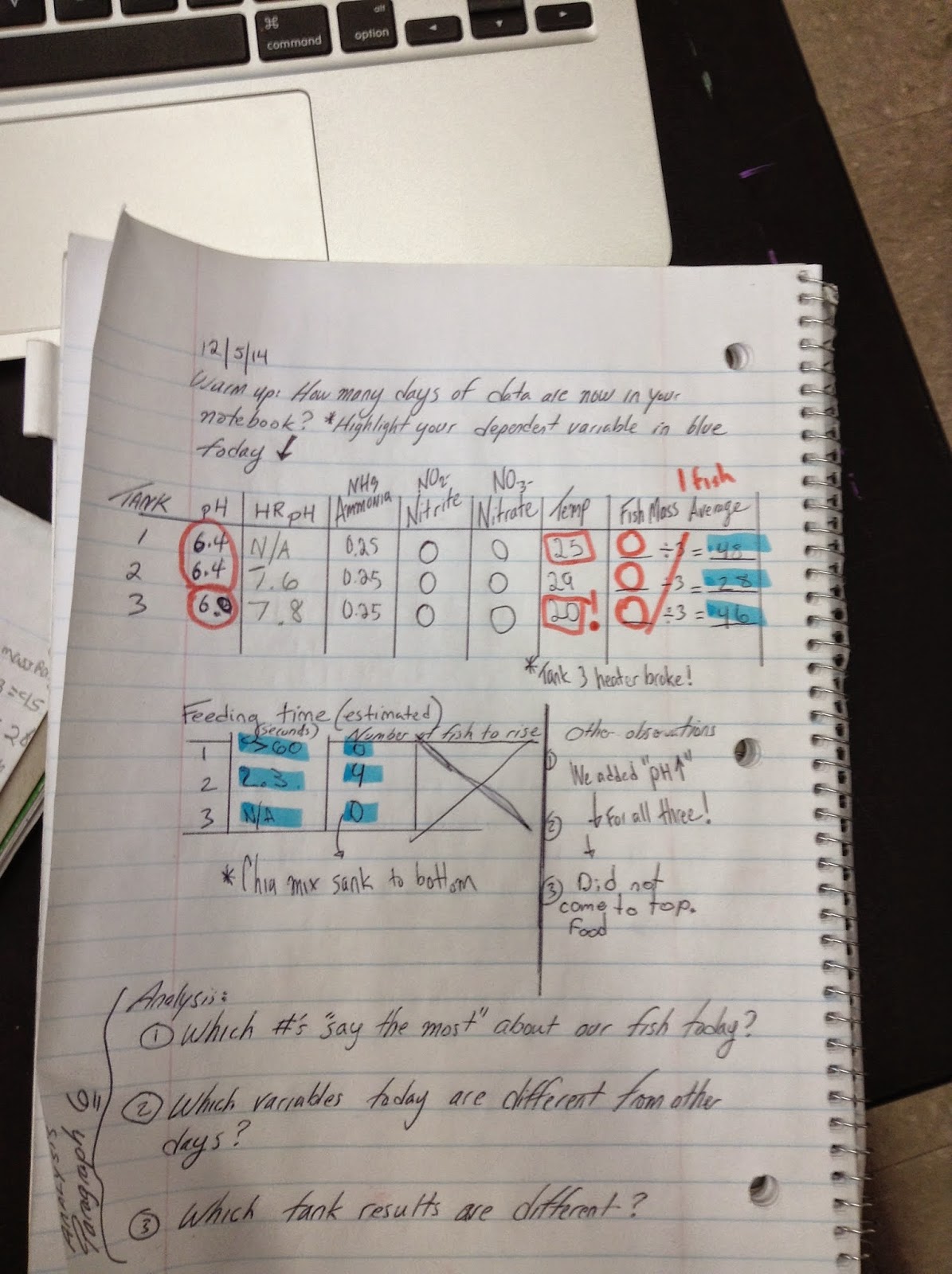
Three New Data Charts!
Your goal is to make three charts that present the data about our Tilapia.
These charts will present data about fish size and mass over time, but require you to check for the average.
For fish size: Find largest fish and smallest fish for each day, and average those two numbers for average fish size. On days when only one number is given, use that number as the average size.
For fish mass: Copy the average mass for each day. Make sure you do not copy the total mass for three fish.
An example of the first chart looks like this...
| Tank 1 | Av. Fish Size (centimeters) | Av. Fish Mass (grams) |
| 10/28/2014 | 6.4 | 14 |
| 11/7/2014 | 5.4 | 18 |
| 11/14/2014 | 6.5 | 16.7 |
| 11/21/2014 | 8.1 | 18.7 |
| 12/3/2014 | NA | na |
| 12/5/2014 | 9.8 | 48 |
| Overall Average | ?? | ?? |
Find the answer to those question marks - what is the average of each column?
Create one more table for Tank 2, and one for Tank 3. Once we have that data, we can really see which tank resulted in faster growth for our fish. We can also calculate the rate of growth for each tank, which is the amount of growth in the total number of days (39 days total?)
Tuesday, December 9, 2014

Friday, December 5, 2014


Subscribe to:
Comments (Atom)